Across many schools, there is a growing fascination with teaching cursive handwriting early—sometimes even replacing print or pre-cursive instruction altogether. Cursive is often perceived as advanced, refined, or academically superior. Parents are impressed. Schools feel distinctive.
But this fascination ignores a fundamental truth of early childhood education:
Children’s bodies develop before their skills do.
What the Science of the Hand Tells Us
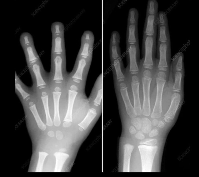
Look at the X-ray images of children’s hands across ages.

A 4-year-old child’s hand still contains a large amount of cartilage. The small bones of the hand and wrist are not yet fully ossified, and fine motor control is still emerging.
By contrast, a 7-year-old child’s hand shows significantly more bone development, stability, and muscular strength.
Cursive handwriting demands:
- Continuous motor control
- Sustained pressure regulation
- Smooth directional changes
- Coordination across multiple joints
Expecting a young child to master cursive before their hand is developmentally ready is not ambition.
It is a biological mismatch.
What Global Frameworks Actually Recommend
Across early childhood frameworks worldwide, the guidance is consistent and deliberate:
- UK – EYFS
Emphasises mark making, correct print letter formation, and legibility. Joined writing is not an early years expectation. - India – NCF (Foundational Stage, 2022)
Strongly cautions against premature formalisation and stresses developmentally appropriate, play-based writing experiences. - Australian Curriculum – Foundation
Focuses on correct print letter formation, spacing, and control. Joins are introduced only in later years. - USA – Early Literacy Frameworks (Common Core–aligned)
Prioritise print handwriting for clarity and fluency. Cursive, where included, appears much later.
These frameworks are developed by multidisciplinary teams—educators, child-development experts, neuroscientists, and classroom practitioners—drawing from decades of evidence.
The Cognitive Cost of Early Cursive
From a cognitive perspective, cursive significantly increases:
- Cognitive load
- Visual complexity
- Motor planning demands
For early writers, this shifts attention away from what truly matters:
- Letter–sound correspondence
- Spelling
- Idea generation
- Confidence in writing
Instead of supporting literacy, premature cursive often results in:
- Illegible writing
- Fatigue and frustration
- Reduced writing output
- Avoidance of writing altogether
A Question We Rarely Ask
Pause for a moment and consider:
- Have you ever seen a children’s book written in cursive?
- A textbook?
- A newspaper?
- A research paper?
Have you ever wondered why not?
The answer is simple:
Clarity matters more than decoration.
Print is used because it is:
- Easier to read
- Faster to process
- More accessible
- Less cognitively demanding
If adults are given clarity, why would children—who are still learning—be given complexity?
What Branding and Design Teach Us About Clarity
Look at the world around us.
Most global brands—especially in education, healthcare, technology, aviation, and public communication—use clean, sans-serif typography. Helvetica (or Helvetica-style fonts) is one of the most widely used choices.
Why?
- Maximum legibility
- Visual neutrality
- Reduced cognitive effort
- Consistency across platforms
No serious brand chooses cursive for core communication.
Not because cursive is unattractive—but because it is inefficient for reading.
Education should not contradict what the real world already understands about clarity.
Brands That Rely on Helvetica-Style Typography


Why This Matters
These brands operate in high-stakes environments—engineering, aviation, healthcare, technology, public safety—where clarity, speed of recognition, and zero ambiguity are non-negotiable.
They do not use cursive.
They do not prioritise decoration.
They prioritise legibility.
If the world’s most precision-driven organisations choose clean print for adults, it is worth asking:
Why do we insist on decorative complexity for children who are still learning to write?
This visual alone makes the argument.
Cursive Is Not the Enemy — Timing Is
This is not an argument against cursive.
Cursive has value:
- For writing fluency
- For personal style
- For historical literacy
But it is not a starting point.
Just as we respect the developmental readiness of the brain, we must respect the developmental readiness of the hand.
A Necessary Line to Draw
When biology, child-development research, curriculum frameworks, and even design science all point in the same direction, ignoring them is not innovation.
It is educational malpractice.
What Truly Matters in Early Writing
Early literacy should prioritise:
- Legibility
- Confidence
- Correct letter formation
- Joy in expression
Not how fancy the writing looks.
No book is written in cursive for ease of reading.
No child should be asked to write in cursive before they are physically and cognitively ready.
Sometimes, the most responsible decision in education is not to impress—
but to respect development.